
Metro Art on Film (Pt. I)--March 2026
Reviewing and photographing the aesthetics of my favorite metro line
This photo blog is partially a response to a similar series by my friend Ori on her blog where she reviews metro stops within Madrid's city center. Her series inspired me to review the stops on LA's metro B line, which I ride most frequently.
I've been wanting to shoot a full roll of film in one day, so I figured photographing these stops could be a good way to limit myself to one subject and period of time.
The unique built environment and art pieces at each stop then led me to look into LA's metro art program, which is much more extensive than I would've thought. Hence, the eventual subject of this post--Metro Art.
Vermont/Beverly
We started at the stop closest to my apartment, where my favorite piece of art is actually unsanctioned.
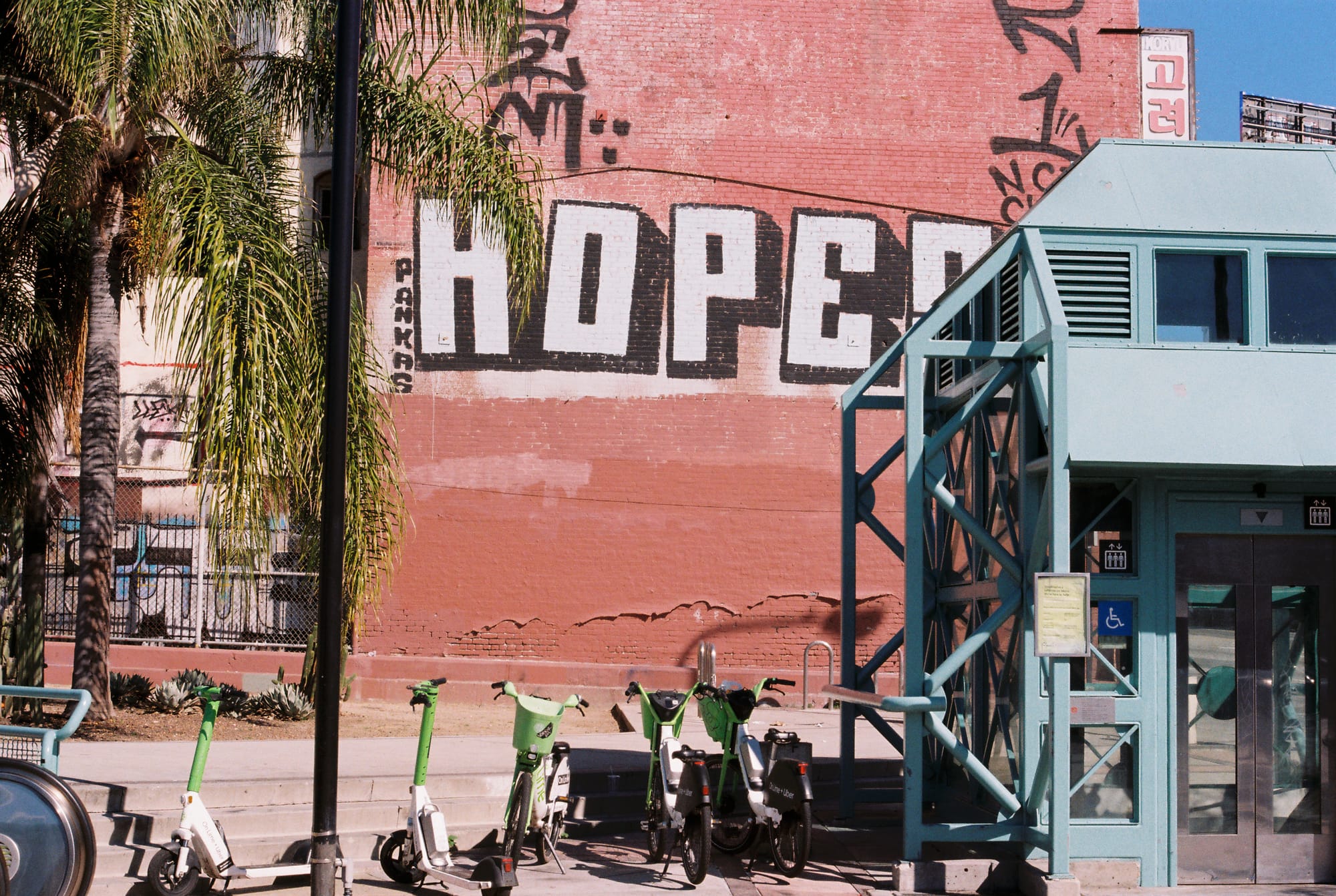
The scan came back kind of weird (maybe the software was correcting for exposure?) but in person the lettering is pretty much the same color blue as the elevator. Hopes is probably the most prolific tagger in the city, so living near one of the tags feels very LA.
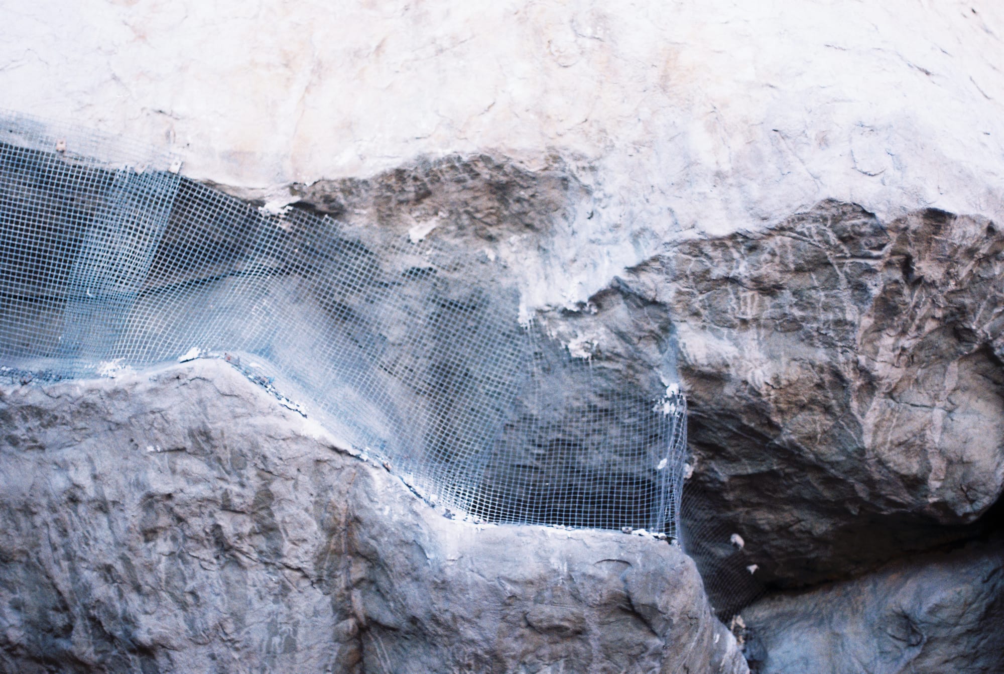
However, the most notable piece of art at this stop is this giant rock formation, pictured here up close with anti-bird mesh (bird control measures are a running theme in these photos). I've always thought it's crazy to have a rock formation at the mouth of the metro stop entrance and on the ceiling inside considering a lot of peoples' main concern with below ground transportation in LA is earthquake safety. I do enjoy that the artist's name is George Stone though.
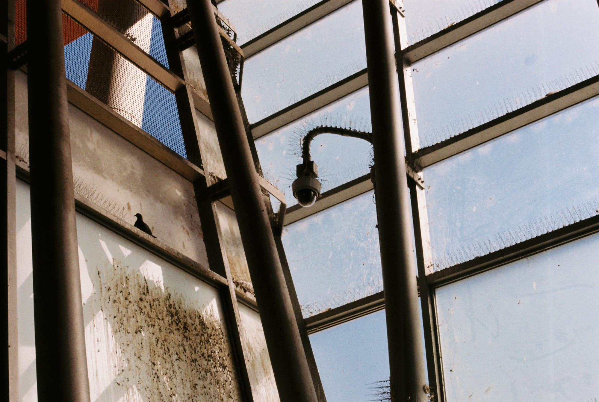
While I love this stop because I consider it "my" stop, on an aesthetic level it's one of the most disjointed. There's no common theme that unites the art pieces or the built environment. I didn't take more pictures (mainly because it's so poorly lit, a problem which will resurface throughout this series), but the inside features a tiled mosaic of shoes, a photo series of koi fish, the continuation of the rock formation, and teal accents throughout the built environment. Very hodgepodge. Also the escalators are always breaking.
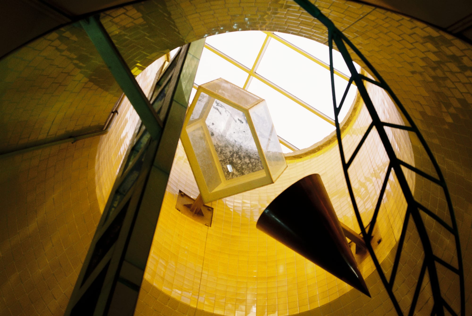
Wilshire/Vermont
This stop has a much more cohesive visual theme. It features lots of bright colors (especially yellow) and whacky geometric shapes. The turnstile entrance is in this oddly asymmetrical structure, the inside of which is absolutely covered in bird spikes. The birds still find a way of course.
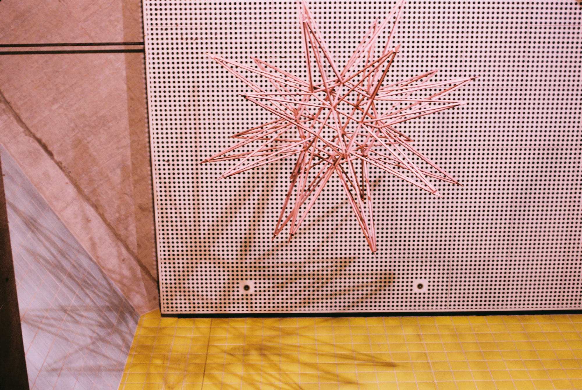
The main art piece on the inside is Los Angeles Seen by Peter Shire, a whimsical series of sculptures that unfortunately represents my main qualm with most metro art. The sculptures are meant to create one cohesive scene, but that scene can only be viewed in full while going down the escalator. And it's very poorly lit. I took this photo while standing directly underneath one of the sculptures, craning my neck.
This art piece and most other metro art pieces are placed in a way where it's clear that you're not really supposed to stand and look at them. They can only be viewed for the moment you're passing by, unless you want to stand in an inconvenient, high-traffic area or crane your neck.
I get that it's hard to place metro art in a way where it won't be damaged. Even this sculpture series, on a seemingly unreachable platform, is riddled with trash. But I still wish there was a better solution. It's also highly likely that the art is placed this way because law enforcement wants to discourage loitering and looking at art gives people a reason to loiter.
Westlake/MacArthur Park
This is one of the tile murals on either side of the upper platform at this station, the other one being La Luna by the same artist. There's also a series of mosaics by a different artist on the wall perpendicular. These murals are obviously gorgeous and they complement the primary colors of the built environment very nicely.
I didn't take many photos because I felt that the photos didn't have anything to add. I mostly took this photo because I thought it's sad that this beautiful art piece is bisected by a column and (once again) in a place that makes it inconvenient to look at for longer than a minute or two.
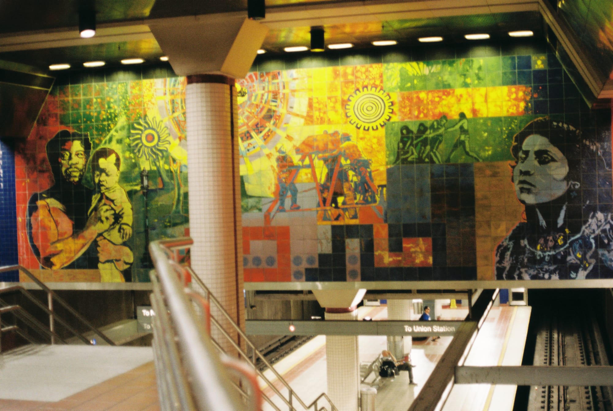
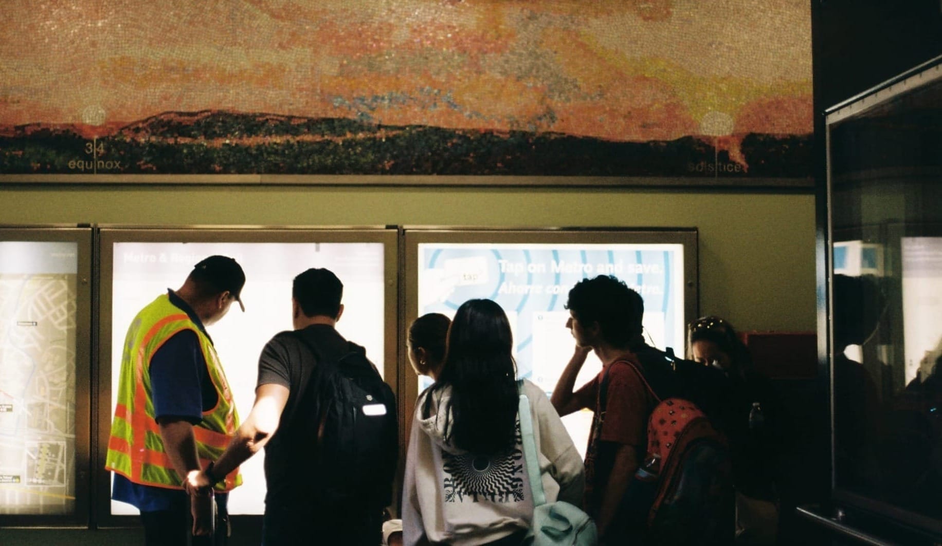
7th St/Metro Center
This stop is probably the busiest because it's where the B and D lines (which are mostly the same) overlap with the E and A lines.
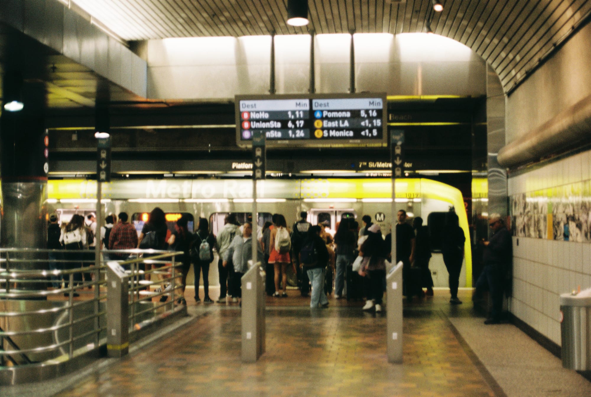
A part of Joyce Kozloff's lovely hand-painted tile series is on the right side of these photos, but I mostly took the photos to show how no one takes time to look at the tiles. Standing by the tiles, I felt like I was in peoples' way and I probably was.
The tiles are really cool and super detailed, but thematically I feel like they should've been at the Hollywood/Vine stop (which I hope to cover in pt II of this series). This is another stop on the B line that feels aesthetically aimless to me. It's pretty bland other than the tiles.
Pershing Square
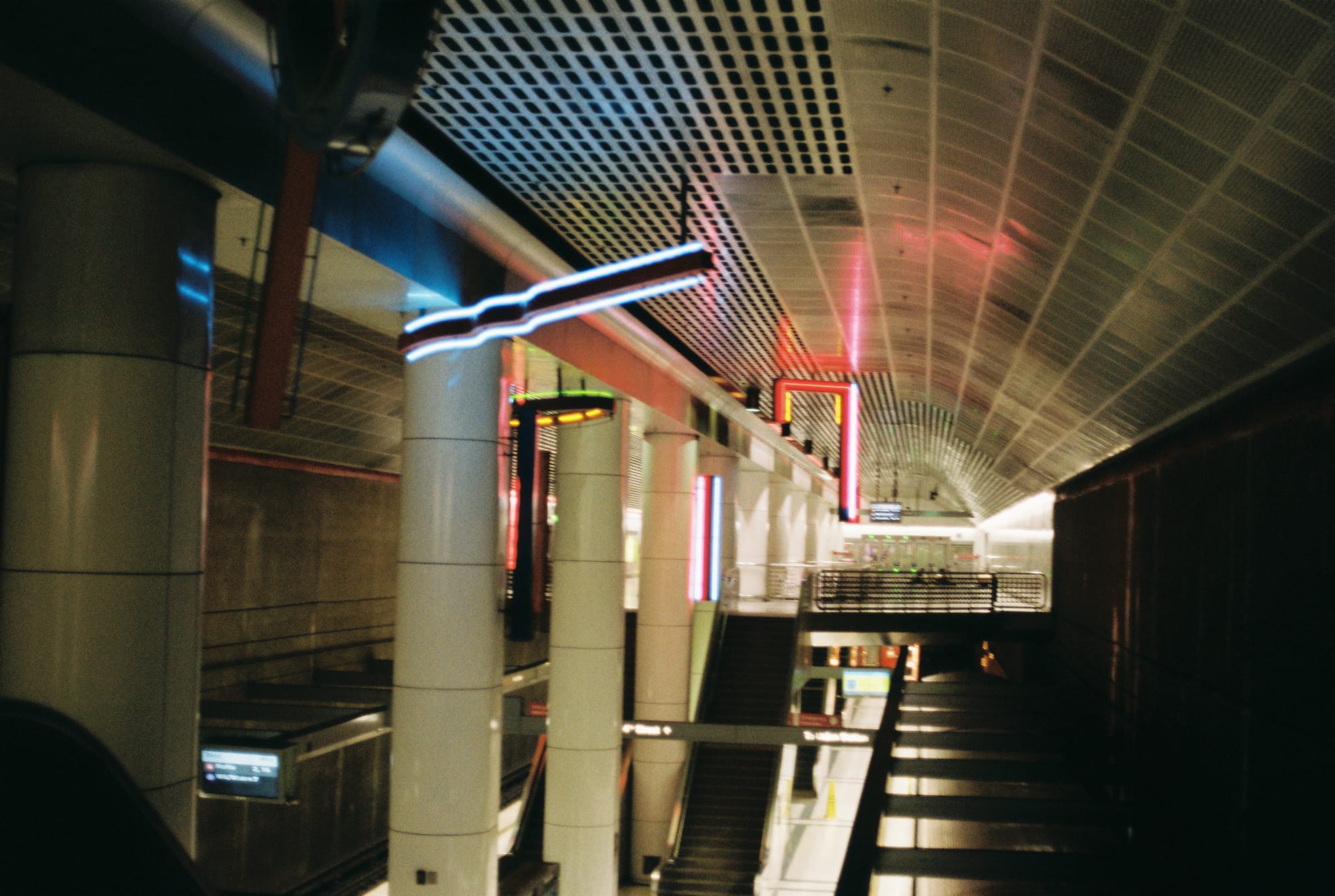
This photo doesn't really capture the vibe of this station, which in my opinion is eery in a way similar to 2001: A Space Odyssey. The white ceilings continue in the hallway past the turnstiles and they're always playing classical music and just trust me it's creepy in a weird, sanitized way. There's definitely aesthetic cohesion though, even if it's unsettling.
This stop gets points for being close to my go to tourist-y spots in downtown. The neons are the main art piece, but I was disappointed to see that a few of them weren't lit when I got there. Hopefully someone's able to fix them.
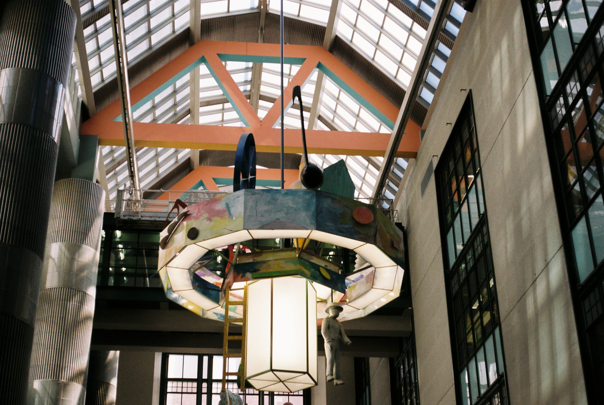
We took a detour when we hit the Pershing Square stop and went by the Central Library. I was happy to notice another installation of Therman Statom's work. Initially I mistook it for another Peter Shire piece, maybe because I associate the colors of the rafters with the Wilshire station. These chandeliers are really cool and I'd never noticed them before doing this project.
Civic Center/Grand Park
This might be my favorite stop on the B line. So of course all of the photos I took here turned out terribly.
These mosaics are super fun. They elicit a childlike urge to go around and look at each one and say "I like this one because..." or "this one looks the most like you." They encourage interaction, even though again they're on the upper platform where no one usually stands.
I also love how they're framed within the tile walls. The built environment really makes this stop for me. Something about the warm peach tones with the mint green accents? I just enjoy it, I don't know why.
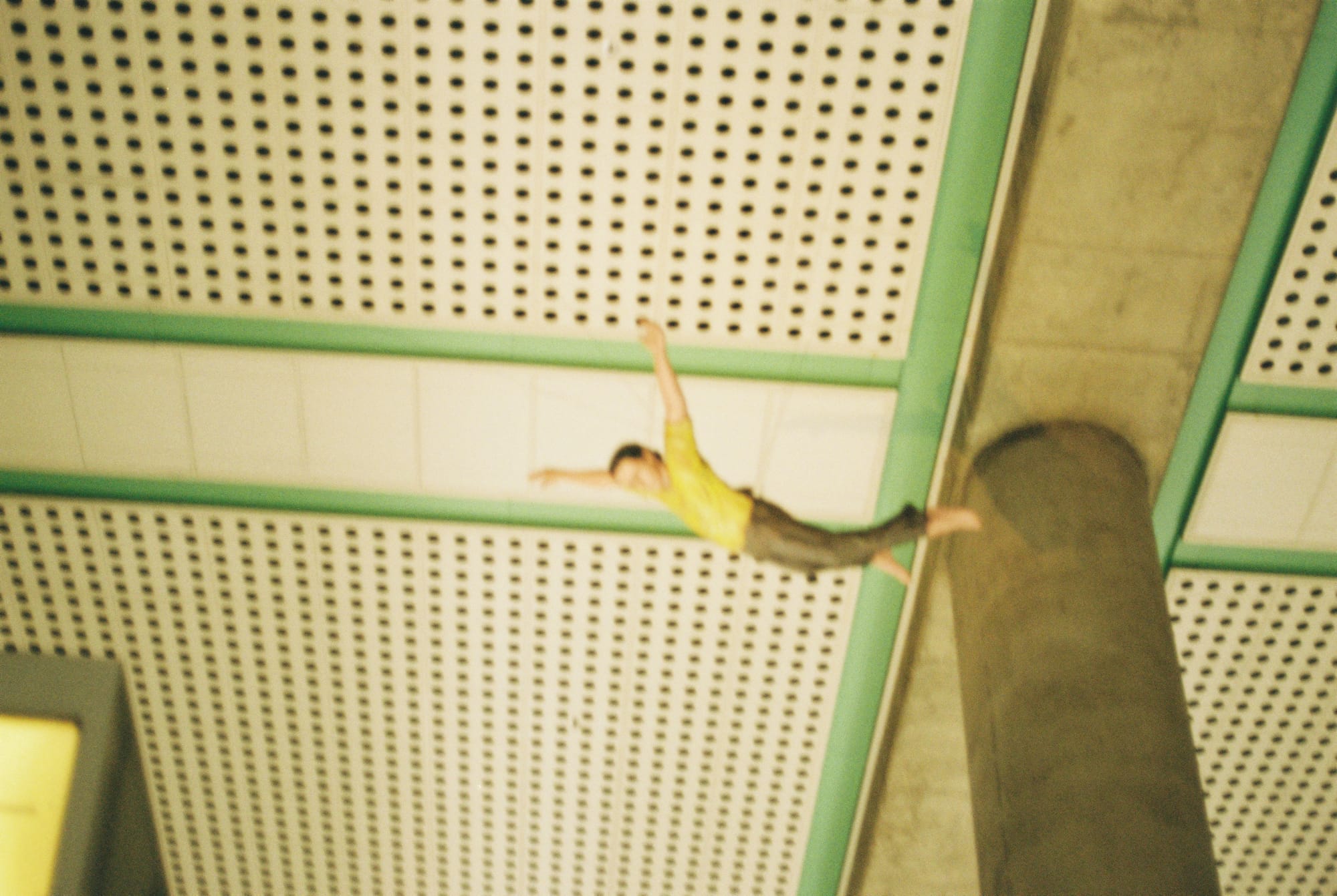
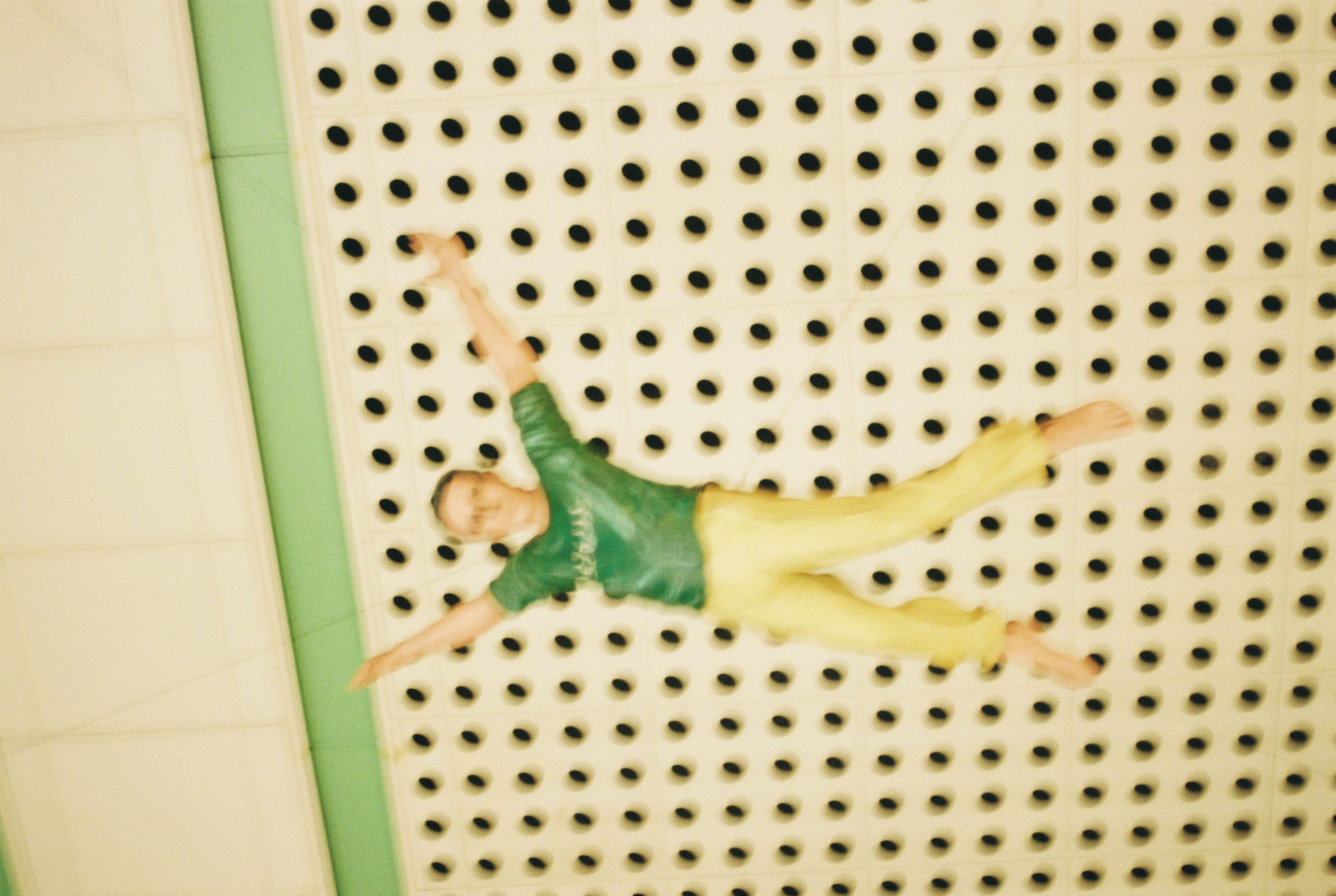
Though I captured them horribly, these life-sized fiberglass figures might be my favorite piece of metro art. There are six of them suspended above the main platform so you can see them right when you get off the train. Sometimes they wobble a little like they're blowing in the breeze. The metro art website claims that there's an audio component that plays bird noises every now and then, though I've never experience that part. They're incredible.
As the title suggests, these figures are based on the artist's dreams of flying, but I confess that the first time I saw them I assumed that they were jumping to their deaths. The artist consecutively numbers his pieces throughout the artistic process, and I thought that the numbers might be some kind of statistic or social commentary. In retrospect I should've known better than to assume that such a public work would be so overtly political.
Even knowing the lighthearted intention behind them now, I still see them as free falling through the air. Does that say something about my psyche? I think the thought appeals to my morbid Gen Z sense of humor. The idea of these clone-like, cartoonish figures jumping with deadpan abandon makes me giggle for some reason, especially when paired with the pitfalls of LA public transit.
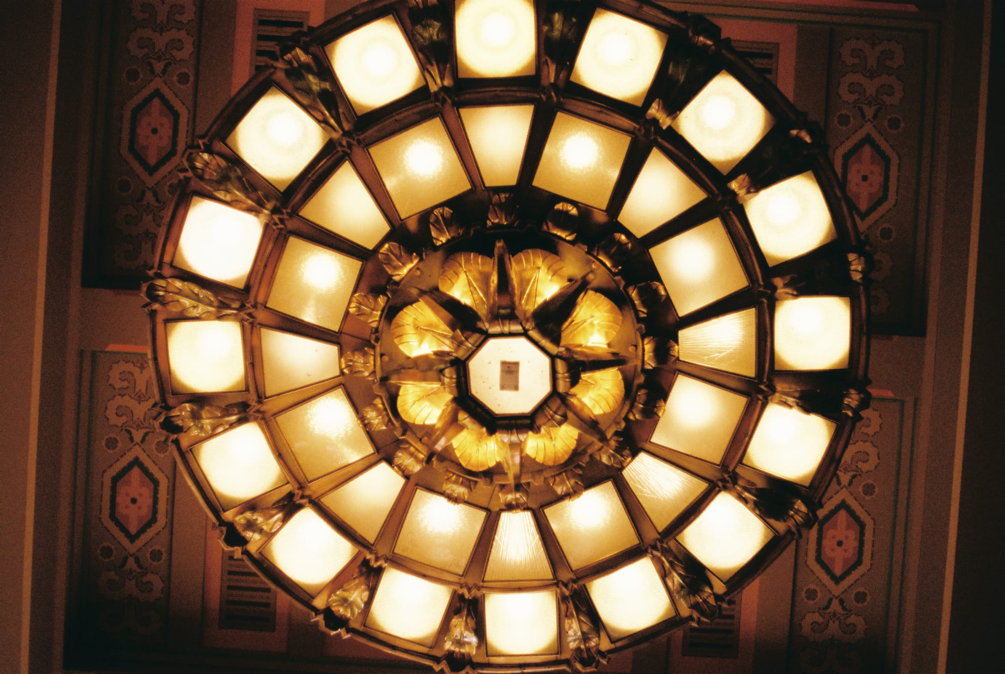
Union Station
There's too much artwork at this station to cover. Most of it is listed on Union Station's own website instead of the metro art website. If I were being a B line purist here, I probably would've documented the Traveler mosaic by Terry Schoonhoven, which is the most notable piece of art at the B line entrance to the station. But it was another case where I felt photography couldn't add anything.
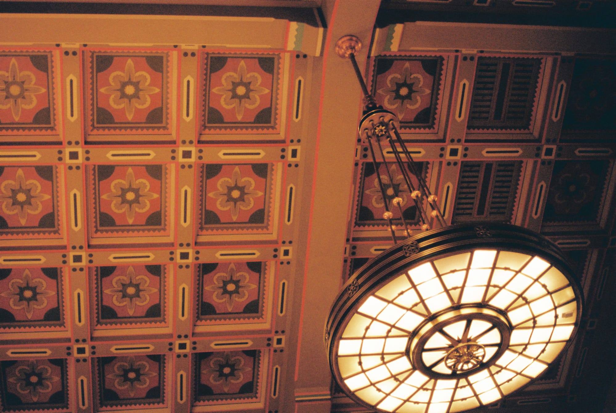
Old Art Deco is my favorite part of LA's architectural landscape.
I would write captions for these photos, but I need to go to bed. This concludes part I of the series. In part II I'll cover the B line stops north of Vermont/Beverly.
In summary, on the metro art so far: It's very beautiful, I like it, I wish there was more of it, I wish it was put in better places and lit better.
In summary, on the photography: I'd like to have a lens that can focus subjects from further away. I long for better lighting (or possibly higher ISO film). I yearn for more sharpness and greater depth of field. I need to keep practicing.