
Metro Art on Film (Pt. II)--June 2026
I finally photographed the rest of the stops on the Metro B. Woohoo!
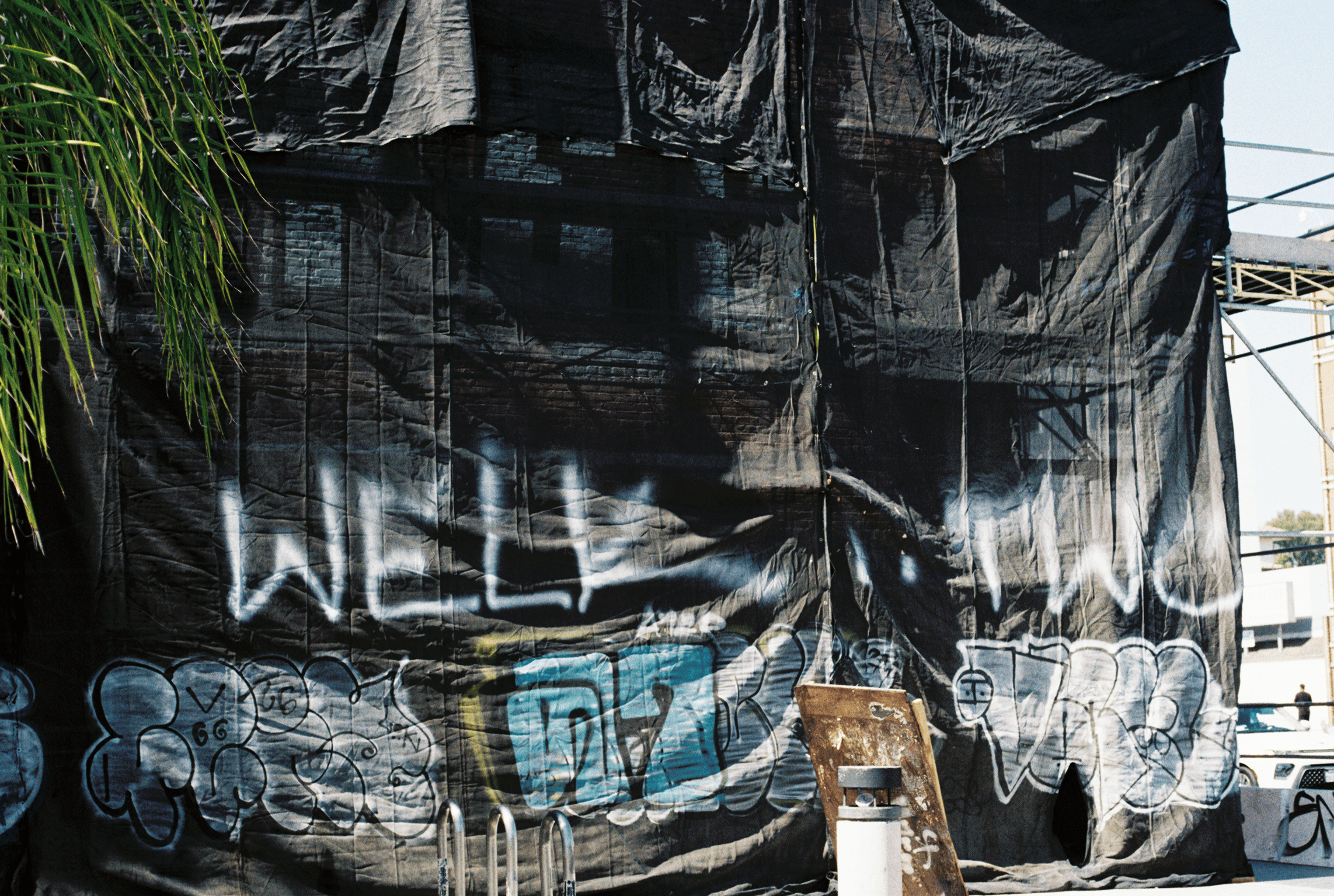
An update on the B line stop closest to me: since my last entry in this series, the building that has the Hopes tag on it burned down from the inside. The building was boarded up prior to the fire and there were no injuries reported.
The fire looked pretty crazy when it was happening but because the building is brick it's actually still pretty intact on the outside. The Hopes tag is still intact underneath the shroud they've put up, though it seems they're in the process of demolishing the building now.
It's not a great loss, since as I mentioned before there are Hopes tags literally all over the city (I even saw one in NY when I visited, so maybe they're all over the country?). I am curious what will happen to the space though.
Vermont/Santa Monica
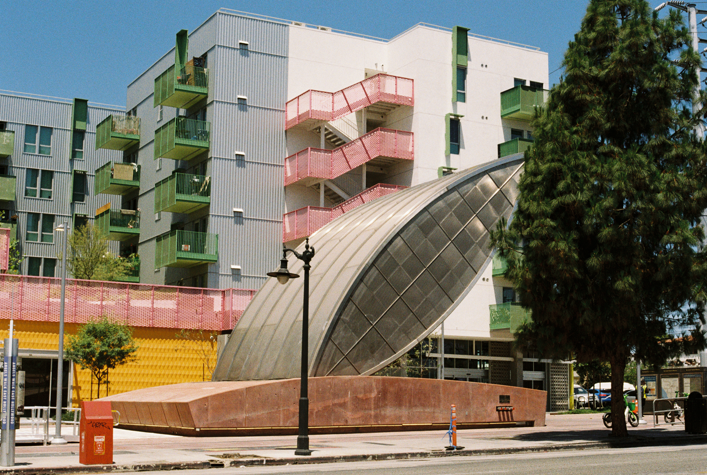
The main piece of art that I associate with this station is actually Kinetic Flow by George Legrady, which is at the other entrance. It's a series of panels that uses ridership data to generate patterns. Unfortunately when I took this photo there was a guy standing by that entrance screaming his head off, so it felt best to avoid going over there.
It was a cool opportunity to appreciate this other entrance, which I don't use as often. The leaf shaped canopy and apparently most of the built environment at the station were designed by Robert Miller. I do enjoy how pieces like this are technically unnecessary, but make it a fun experience to find the metro station and go inside.
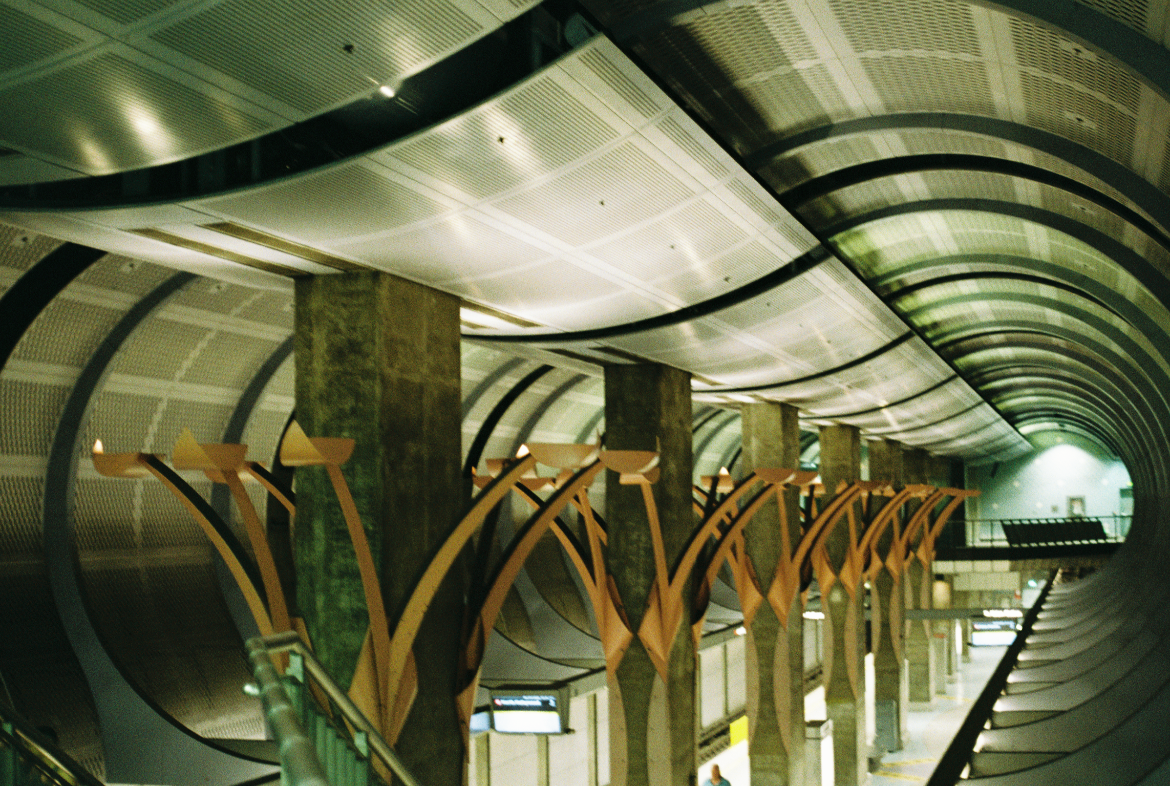
Vermont/Sunset
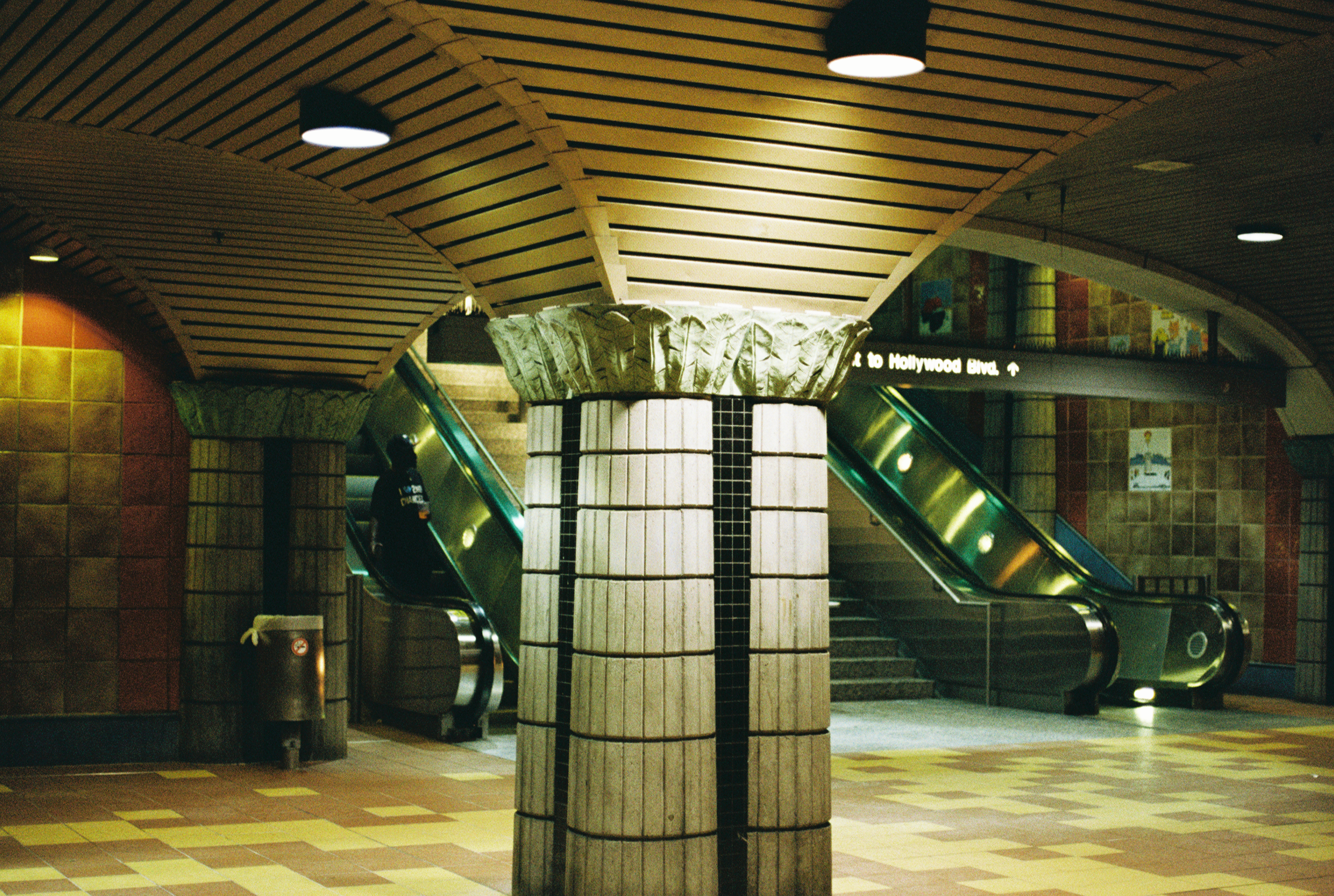
This is the metro station that I use the most because it's close to places that I like to go. It also has what I consider to be the most cohesive built environment out of all the stations.
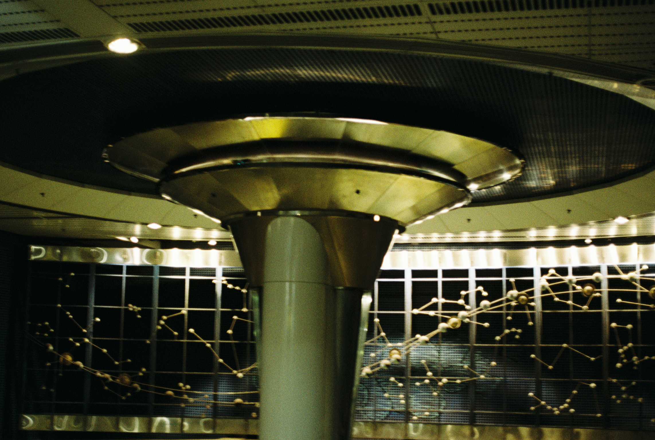
Being on the mezzanine above the platform makes me feel like I'm in a cool science museum and also like I'm about to get on a space-themed roller coaster.
I don't know if Michael Davis was also responsible for the elevator here (if the Metro Art website lists a collaborating architectural firm for this stop then I couldn't find it).
I don't think either of the photos I took capture the scale of this station and how fun it is. This photo was taken while coming up the escalator. The escalators are angled to sort of wrap around this retro-futurist looking elevator tower and the palm trees grow up out of the same subterranean plateau. It's epic.
Somewhere around here on my Metro journey I saw a guy get escorted out of the station by security because he was sleeping on the platform. He wasn't bothering anyone, he was just lying down. I and the other person waiting for the train looked away and didn't say anything.
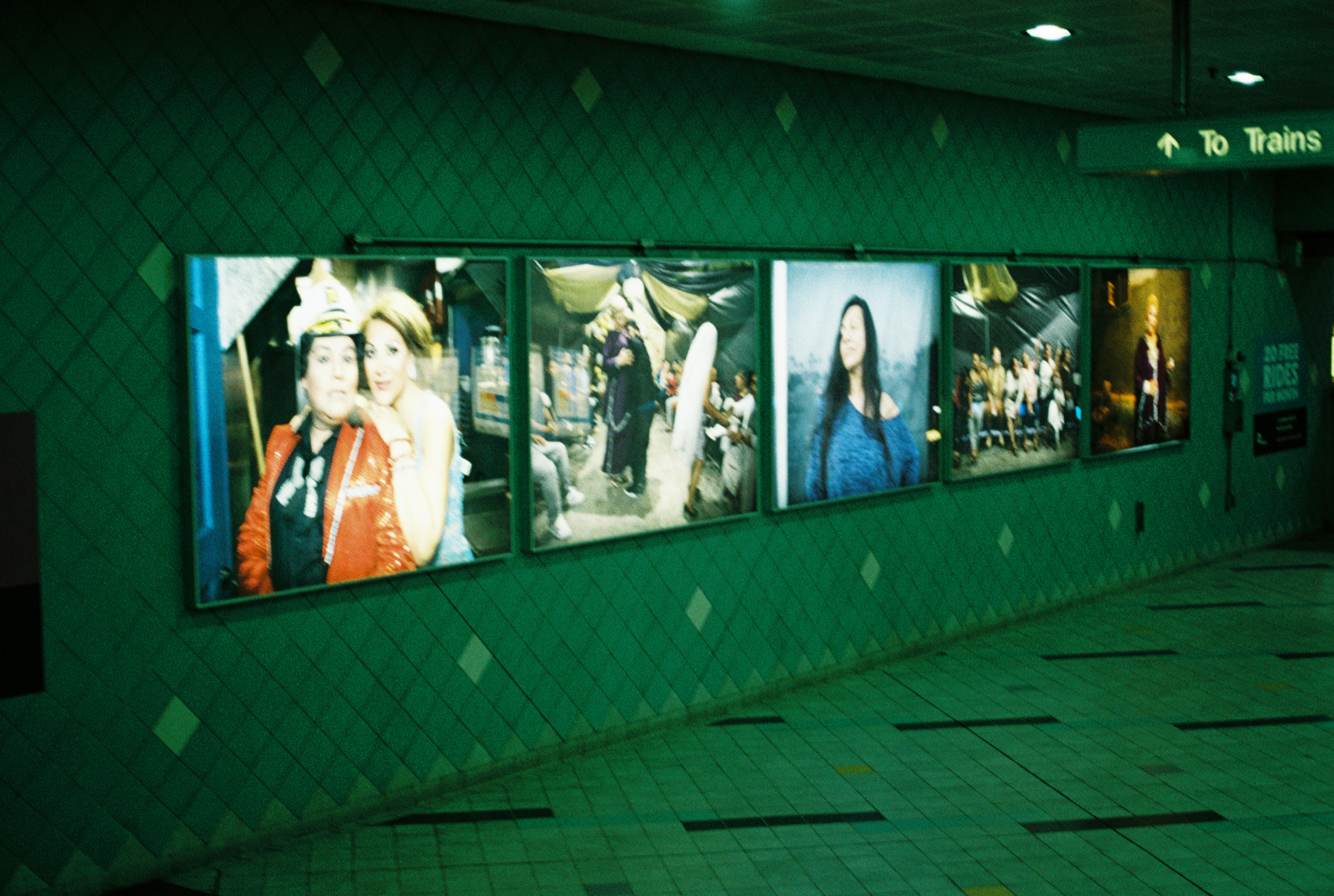
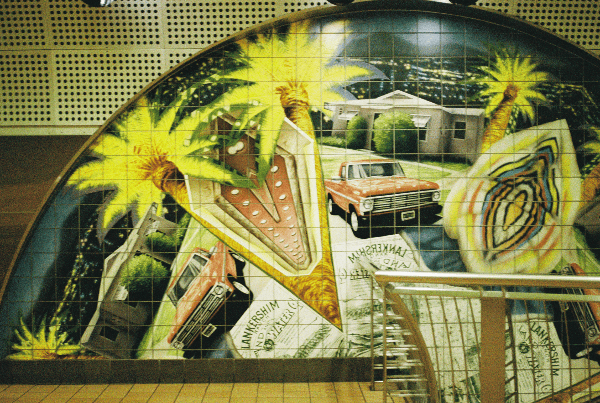
Hollywood/Western
This is the only photo I got at this station and it kind of sucks. This part is right by the turnstiles, which means if you take the time to stop and look, you also have the opportunity to open the gate for people who don't want to pay the fare.
The whole station has a lot of cool visual nods to the cultural, ecological, and public transit history of the area. The tiling covers the walls and floors throughout. The tiling is my favorite part. It makes me feel a certain way I can't describe.
My main qualms are the poor lighting and wall ads. May Sun's design includes two Pacific Electric Red Car replicas on the mezzanine wall, which would be super cool if I could see them better. And the ads on the walls take away from the all-encompassing effect of the tiles, in my opinion.
Hollywood/Vine
The aesthetic of this station is what inspired this series of posts. It's iconic.
The entire station is cited as Hooray for Hollywood by Gilbert “Magu” Lujan in collaboration with Miralles Associates, Inc. on the Metro Art website.
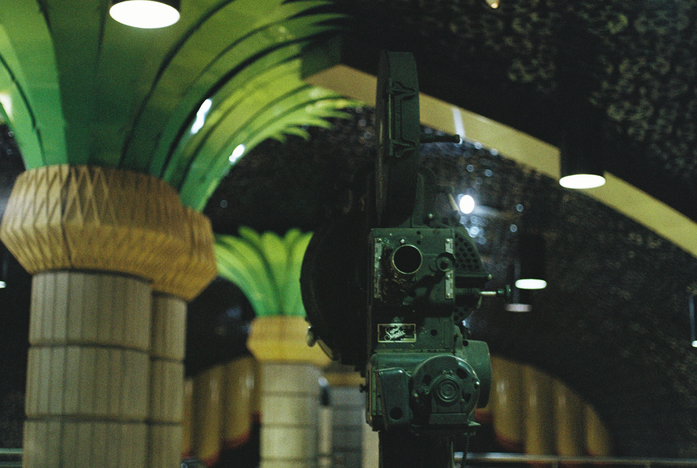
The mezzanine is incredible--columns shaped like palm trees with metal fronds, the ceiling covered in film reels, and two old film cameras on display. I wish I had more information about the cameras and what era they're from. I think I tried looking for a plaque. Maybe I'm bad at finding things.
You can also see in the background of this photo that the mezzanine wall has a (ceramic? metal?) curtain, which frames a blank white screen as though you're in a movie theater. I wonder if they ever project films onto that screen or if they used to at one point. I have a feeling if they did it would encourage loitering, which is probably why they don't.
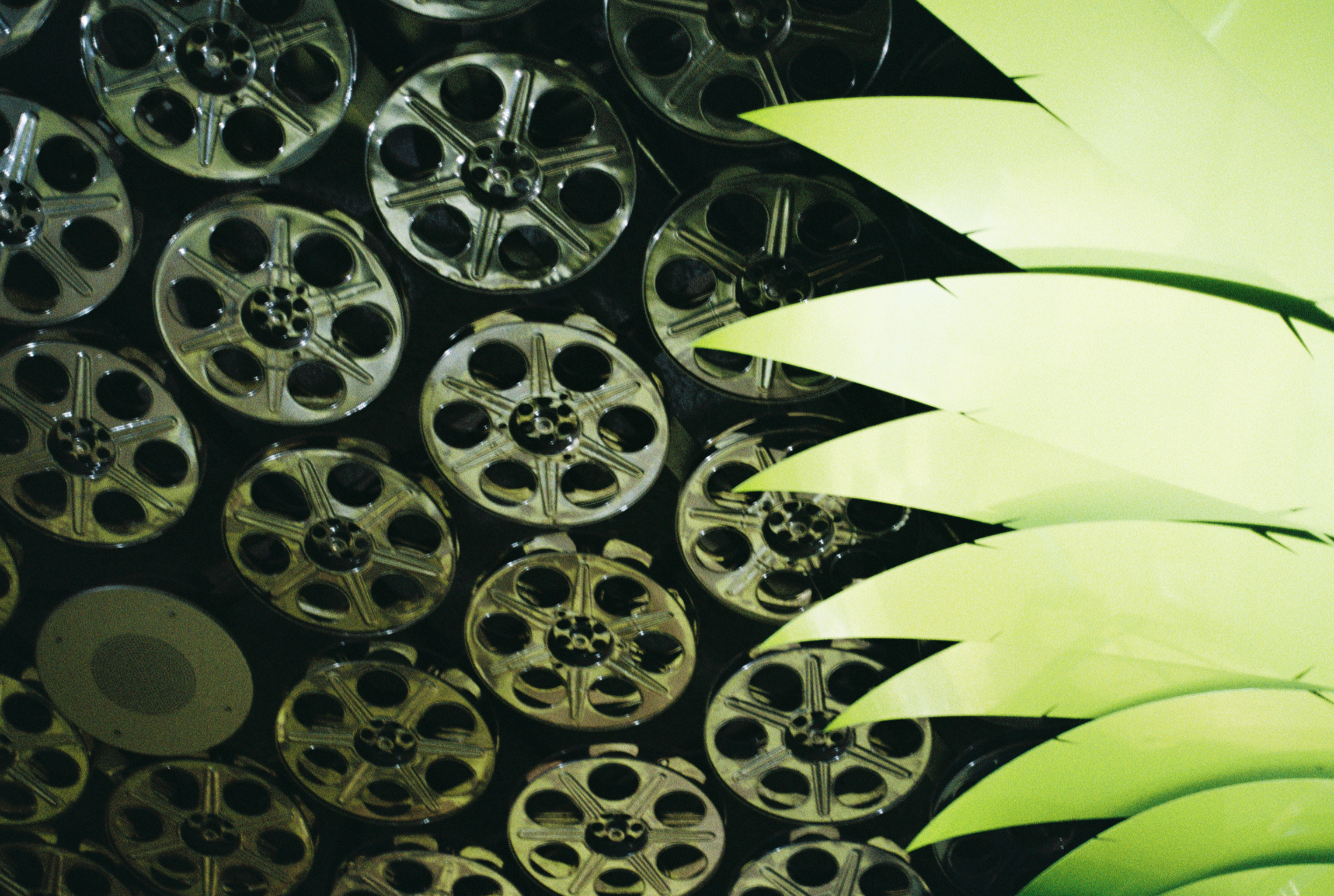
Seriously, the ceiling is so stunning and cool to look at.
Another film-related detail here that I didn't photograph but I do enjoy--The walls on the track across from the platform have film strips painted on them in blue. Sort of makes you think about the kinetic similarity between train cars passing through a station and a film strip passing through a projector. Delightful.
I wouldn't describe the built environment of this station as cohesive like I would Vermont/Sunset, but somehow it just works. It's so maximalist and mix-matched in a way that makes me so happy. Look at all of the different textures in this photo alone! Tiles of all shapes and sizes.
Also, if you exit up the depicted escalator you rise through a tunnel of golden light and see the Pantages surface like the morning sun emerging on the horizon.
It's pretty fucking magical.
I kind of hate the walk of fame and I typically avoid this area because I think of it as LA's version of Times Square (overcrowded, overstimulating, touristy, and gross). This metro station really makes me appreciate it though.
Hollywood/Highland
The only citation for this station on the Metro Art website is as Underground Girl by Sheila Klein. Therefore I'm assuming that all of the art pieces can be accredited to that artist, though I'm not sure.
My main qualm with this station is lack of context. I have no idea what the context for these photos is. It's also unclear whether the photos are supposed to connect in some way to the built environment in the rest of the station.
The tiles are baby blue, though it doesn't come through in this photo because the station is also poorly lit. You can see an ad on the right side edge of the photo, another distraction from the art.
The colors here are somewhat accurate to the colors in real life. I assume based on the photo on the Metro Art website that the paint has faded over time. The floral sculptures are depicted as bright red and the curved supports as bright blue. The photo is accompanied by a sort of heady description of what it represents.
I think this station is similar to the Hollywood/Western station in that it has a lot going on and is very mixed media. It also has some of the same aesthetic disruptions–Poor lighting, ads. At least the Hollywood/Western station has legible descriptions of the historical context that provides a common theme for its seemingly disjointed pieces. This station is kind of a mystery to me.
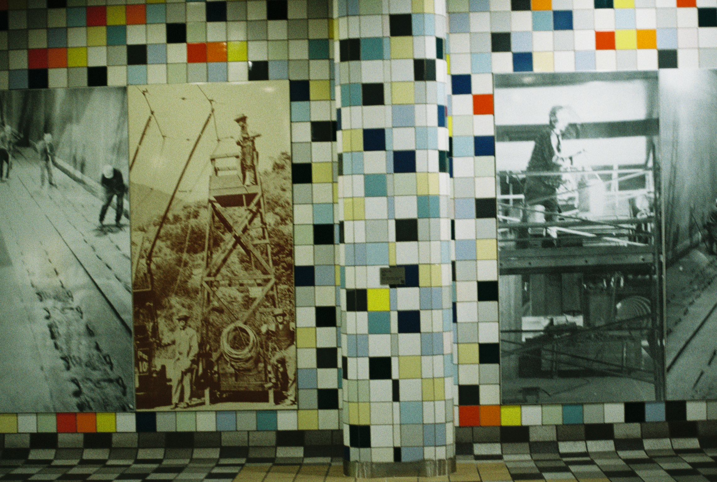
Universal/Studio City
I had only ever been to this station once before. I used to work in Studio City and I tried taking public transit once to get there before realizing it took three times as long as it would to drive.
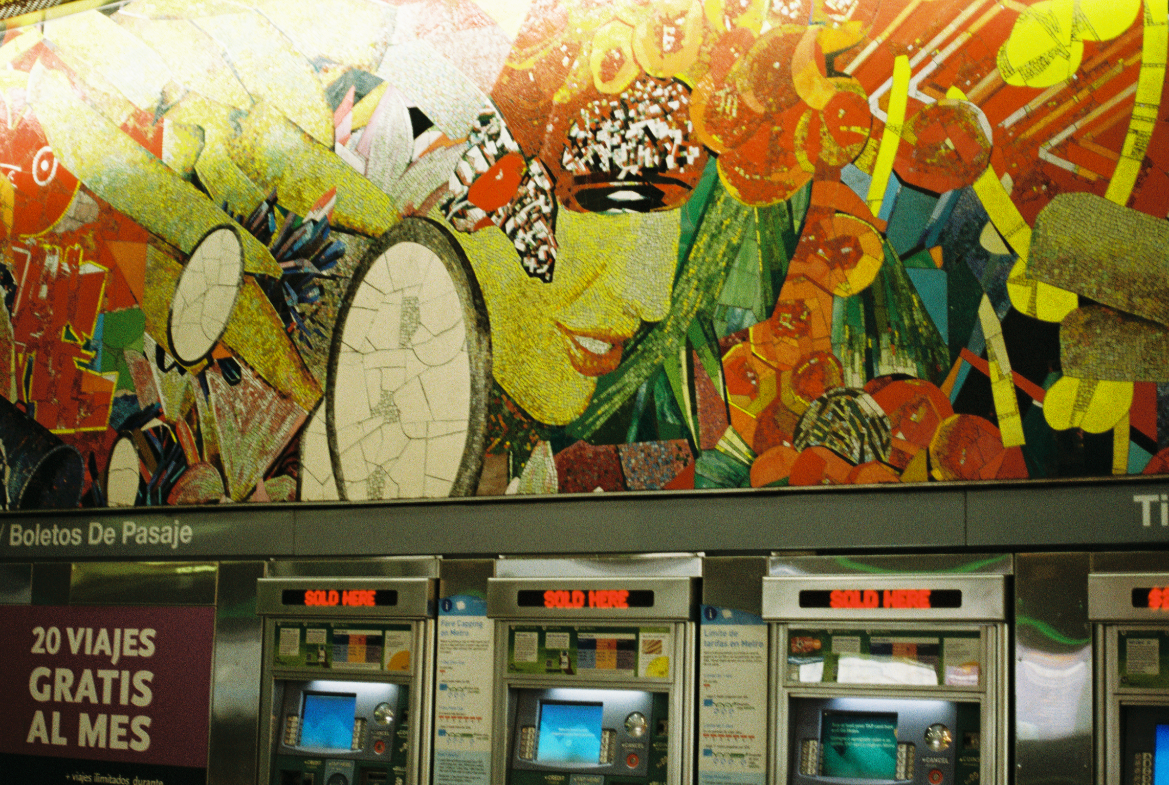
I'm very glad to have visited this station again because it has what I think is my new favorite piece of Metro art (sorry Jonathan Borofsky, you still hold a special place in my heart). The piece is...
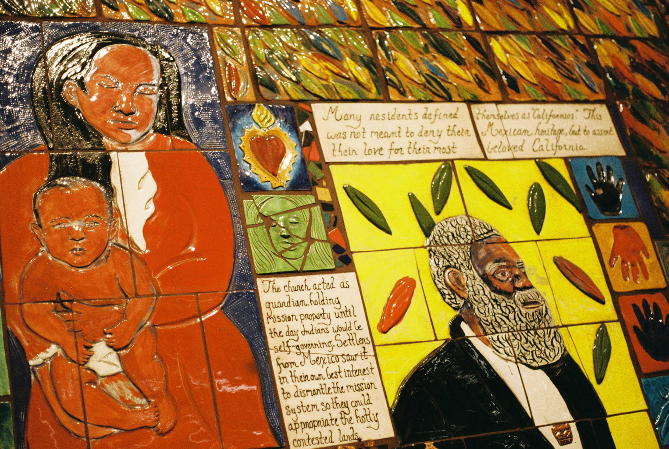
These mosaics cover all of the columns on the train platform (yes, art that's actually viewable on the platform for once!). I was mostly struct by how beautiful they are, colorful, textural, three dimensional. Then I started skimming the text and realized how rooted the piece is in historical context.
The text narrates how Mexico relinquished control of California to the United states in 1847. I photographed the English side--The opposite side has the same mosaics with narration in Spanish.
I couldn't believe I hadn't noticed this piece when I had been to the station before. It's gorgeous, accessible to riders, and gives a firm sense of place.
The wall panels and railings throughout the built environment also give a sense of context that I didn't realize until reading more. I had thought the design was a random pattern, but it's actually the Mayan letter "G."
I wish I had stayed to read the whole mosaic (maybe one day), but the train actually came on time and security had done a TAP Card check when I came over from Hollywood/Highland, so I was feeling antsy about lingering.
North Hollywood Station
The coolest part of this station is probably its entrance. The photo I took of that turned out bad, so you'll have to see it for yourself (or look it up online).
I really like the mosaics in this station. They're all circular and mirrored in these kaleidoscopic distortions (as the name suggests). It's hard to enjoy them because this is the end of the line and you get the feeling that you're really not supposed to hang around.
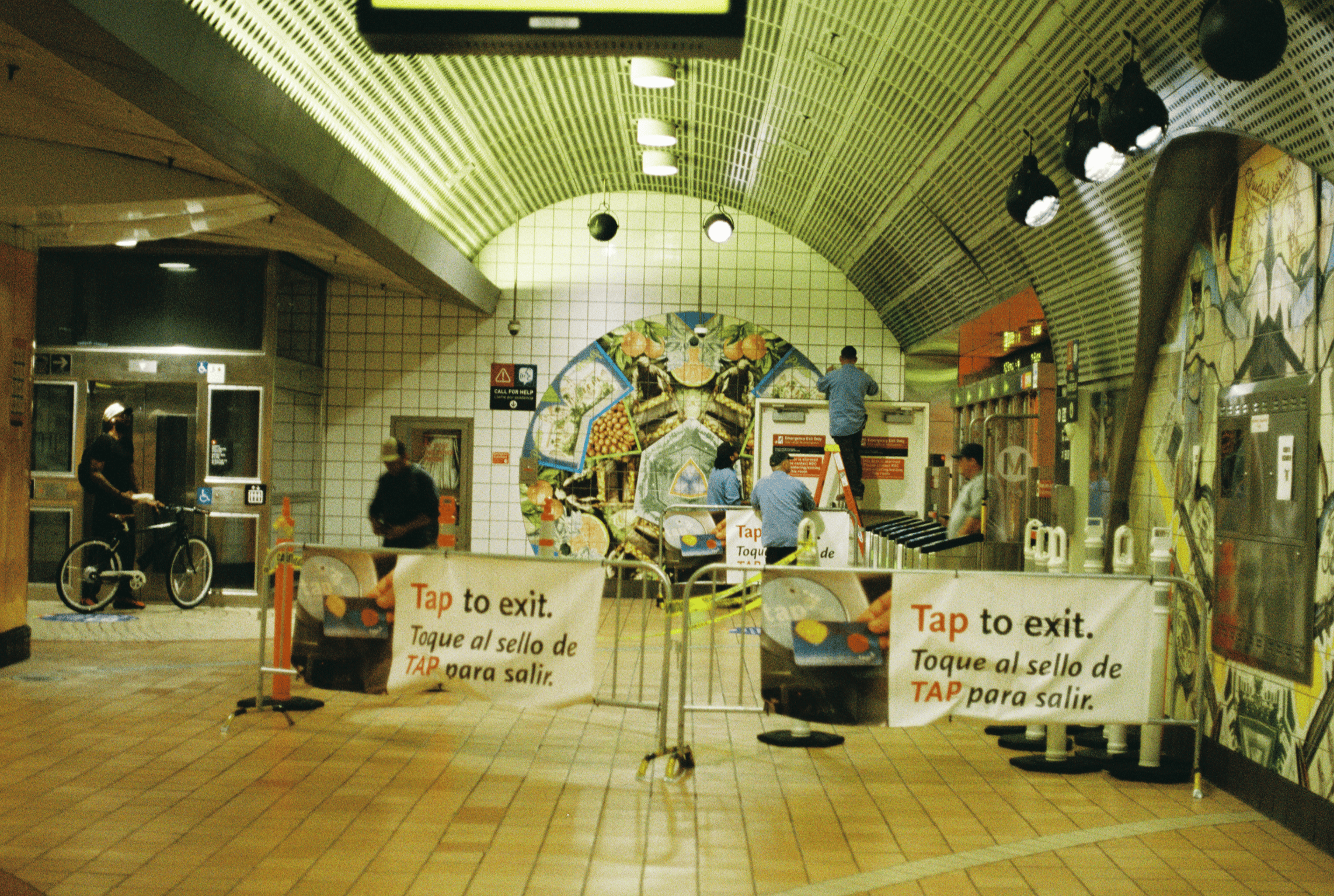
The other thing that made this station feel chaotic, aside from the implied pressure to leave as fast as possible, was that multiple employees were either making repairs or cleaning up messes at different points throughout the station. Maybe I was there at a certain time of day when they do that.
I exited the station and then reentered, but the machine wouldn't take my TAP card because it said I had used it too many times. Luckily the city recently started accepting credit cards at the turnstiles, so I did that. I wonder how long I would've had to wait for my TAP card to work again.
Final Thoughts
So that's it! I took at least one picture at all of the stops on the Metro B line!
I initially started this project as a way to practice using my camera. It ended up being a lovely way to pay more attention to the city I live in. I have a car so I don't take public transit very often. Usually when I do it's because I don't want to bother with parking or I have some extra time to kill. The reality is that public transit in LA is much slower and more inconvenient than driving most of the time.
This series made me think that even if the LA Metro is notoriously inferior to public transit systems in other major cities (New York, DC, Singapore, Tokyo, any city in Europe), there's still a lot to love about it. The wide-ranging aesthetics of the stations feel reflective of the city itself, which can look drastically different depending on what neighborhood you're in or even what street you're on.
I like to think that these artists imagined Metro stations as a place for art to be accessible, an opportunity for people to appreciate their everyday surroundings. The care put into these pieces makes me wish that these stations could be more of a community hub, a place to hang out rather than a place to pass through.
As is, the stations feel hostile to anyone who isn't hurrying to a destination. In my opinion, hurry doesn't suit LA. LA is chill. The LA Metro is often unchill. I think these artists wanted these stations to be chill.
Still, the art brings me joy and makes me feel more grounded in my physical surroundings. Thank you to all LA Metro artists, architects, and to the workers who maintain the pieces. It does not go unnoticed. <3